Coronavirus by the numbers
So I'm a bit of a geek, I like maths and I like playing with data. Having seen all the news posts, social media and the impact on the ability to buy toilet roll - I decided to have a look at the numbers to see if the numbers we are seeing worldwide can help predict what might happen in the U.K.
I should add that I am not a scientist, I have just looked at raw numbers and averages - there will be many different components that have an impact on the spread of the virus that I haven't taken into account.
The first thing I looked at was the number of daily cases across China, Italy and the U.K. Now the numbers from China are open to interpretation as early on most cases were not clinically diagnosed - so they may not be perfect. That said, I am no scientist or expert in this field so this whole post is only based on the data that I can get access to and limited by that.
Here's how the numbers look:

Ok so due to the amount in China, this distorts the view somewhat and makes the UK numbers look tiny. So nothing to worry about?
If we take the China numbers out then we get this:
 Ok, so we can see it is an upward curve but still nothing like Italy so still not much to worry about is there?
But these graphs don't tell the whole story, it's fairly obvious that China and Italy had a head start on the UK and so to get the full picture we would need to start making some predictions and extend the timeline out somewhat. To do this I took the average daily increase in cases for the last 10 days and plotted that into the future. If we look at the daily increases in Italy vs the UK we can see that Italy had some major spikes early on that accelerated the spread of the virus, this hasn't happened in the UK but in the main the daily average increase has been very similar:
 So if we take the average daily increase in the UK over the last 10 days and then use that as the daily increase over the next few weeks, suddenly the graph looks very different:
 Ok so now we can see that actually we are in a similar position to Italy, we are just a little bit behind in the spread of the virus - the upward curve looks similar as we move forward, it is just taking a little longer to get to that point due to the big jump of infections that Italy had early on.
This is now starting to look a little more worrying, with Italy currently on just over 9,000 cases and a countrywide quarantine just announced - if we are in a similar position but slightly behind the curve then when are we likely to see some drastic measure in the UK?
Well with an average daily increase of 34% over the last 10 days, I am predicting that we will be in a similar position to Italy in 12 days. Best case with an average of slightly lower daily increases of 29% (this is the average in the UK over the last 4 days) it would be 13 days.
I don't think this is why people are hoarding toilet paper and pasta, but regardless, we should be taking this seriously - it is coming and we need to be prepared for some drastic changes to our daily life in the short term. The Chinese have demonstrated that the only way to get this under control is to take those measures and hopefully we will start to see the same reduction in new cases in Italy due to the measures they have put in place.
Another thing to look at is the daily case increase based on a point of critical mass, there is quite a long tail at the start so what if we removed the tail and looked at the numbers from the point when the virus really starts to spread - I randomly picked 100 cases as Day 1. The graph now looks like this for the UK, China and Italy if we predict the coming weeks based on a 29% daily increase in the UK and 24% in Italy (the daily average has started to decrease there, presumably because they have put measures in place):

We can see that the predicted UK curve is similar again to Italy, the Chinese curve is still different from the two European countries with a straighter line.
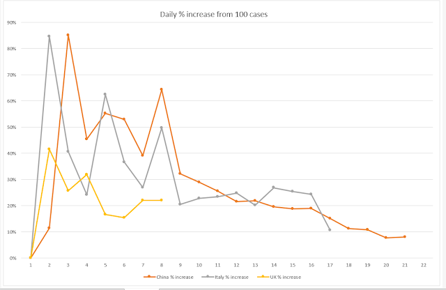
One thing that is really interesting is if you look at the % daily increase when using case 100 as Day 1:

Whilst the UK numbers are clearly lower than the other two countries, they follow a very similar pattern, in fact the pattern is almost identical to the Chinese pattern. Lets's hope that this doesn't follow the sharp increase seen in China after day 5 of having 100 cases and starts to follow the Italian pattern of a decline - again hopefully without the major spike on day 8 in Italy.
But without any real measures being taken in the U.K, hope is all it is right now.
This post is in no way meant to scaremonger or give advice - just presenting the data!
I should add that I am not a scientist, I have just looked at raw numbers and averages - there will be many different components that have an impact on the spread of the virus that I haven't taken into account.
The first thing I looked at was the number of daily cases across China, Italy and the U.K. Now the numbers from China are open to interpretation as early on most cases were not clinically diagnosed - so they may not be perfect. That said, I am no scientist or expert in this field so this whole post is only based on the data that I can get access to and limited by that.
Here's how the numbers look:

Ok so due to the amount in China, this distorts the view somewhat and makes the UK numbers look tiny. So nothing to worry about?
If we take the China numbers out then we get this:

But these graphs don't tell the whole story, it's fairly obvious that China and Italy had a head start on the UK and so to get the full picture we would need to start making some predictions and extend the timeline out somewhat. To do this I took the average daily increase in cases for the last 10 days and plotted that into the future. If we look at the daily increases in Italy vs the UK we can see that Italy had some major spikes early on that accelerated the spread of the virus, this hasn't happened in the UK but in the main the daily average increase has been very similar:


This is now starting to look a little more worrying, with Italy currently on just over 9,000 cases and a countrywide quarantine just announced - if we are in a similar position but slightly behind the curve then when are we likely to see some drastic measure in the UK?
Well with an average daily increase of 34% over the last 10 days, I am predicting that we will be in a similar position to Italy in 12 days. Best case with an average of slightly lower daily increases of 29% (this is the average in the UK over the last 4 days) it would be 13 days.
I don't think this is why people are hoarding toilet paper and pasta, but regardless, we should be taking this seriously - it is coming and we need to be prepared for some drastic changes to our daily life in the short term. The Chinese have demonstrated that the only way to get this under control is to take those measures and hopefully we will start to see the same reduction in new cases in Italy due to the measures they have put in place.
Another thing to look at is the daily case increase based on a point of critical mass, there is quite a long tail at the start so what if we removed the tail and looked at the numbers from the point when the virus really starts to spread - I randomly picked 100 cases as Day 1. The graph now looks like this for the UK, China and Italy if we predict the coming weeks based on a 29% daily increase in the UK and 24% in Italy (the daily average has started to decrease there, presumably because they have put measures in place):

We can see that the predicted UK curve is similar again to Italy, the Chinese curve is still different from the two European countries with a straighter line.
One thing that is really interesting is if you look at the % daily increase when using case 100 as Day 1:

Whilst the UK numbers are clearly lower than the other two countries, they follow a very similar pattern, in fact the pattern is almost identical to the Chinese pattern. Lets's hope that this doesn't follow the sharp increase seen in China after day 5 of having 100 cases and starts to follow the Italian pattern of a decline - again hopefully without the major spike on day 8 in Italy.
But without any real measures being taken in the U.K, hope is all it is right now.
This post is in no way meant to scaremonger or give advice - just presenting the data!

Comments
Post a Comment